
About Us
Synergy Mechanical & HVAC Solutions Inc. is an organization specialized in providing a wide…
Read MoreMission Statement
Our Mission is to provide best possible engineering services and innovative ideas which hold…
>Read More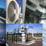
Professional Services
Synergy Mechanical and HVAC solutions Inc. professional team has over 14 years of Mechanical…
>Read More
Recent Work